
When Rachel Allen first approached me about evolving her brand ecosystem, I was immediately intrigued by the challenge.
Here was someone who had built an impressive career crafting strategic messaging for complex industries, yet her own brand architecture had evolved organically without the same strategic consideration she brought to client work.
-
Rachel operates under two distinct but related brands: Bolt, her strategic consultancy focused on client work, and her personal brand for independent writing projects. Over time, these had diverged visually, creating a fragmented ecosystem with five different typefaces and no clear relationship between the identities. Neither brand fully conveyed the sophisticated nature of her work or the unique blend of strategic rigour and creative flair that sets her apart. As Rachel's practice evolved from copywriting into sophisticated strategic consulting, her brand presentation failed to keep pace. The Bolt brand had become too conservative, while her personal brand operated with an inconsistent visual language. I knew I needed to create a cohesive system that would reflect her premium market position while allowing each brand to maintain its distinct purpose.
-
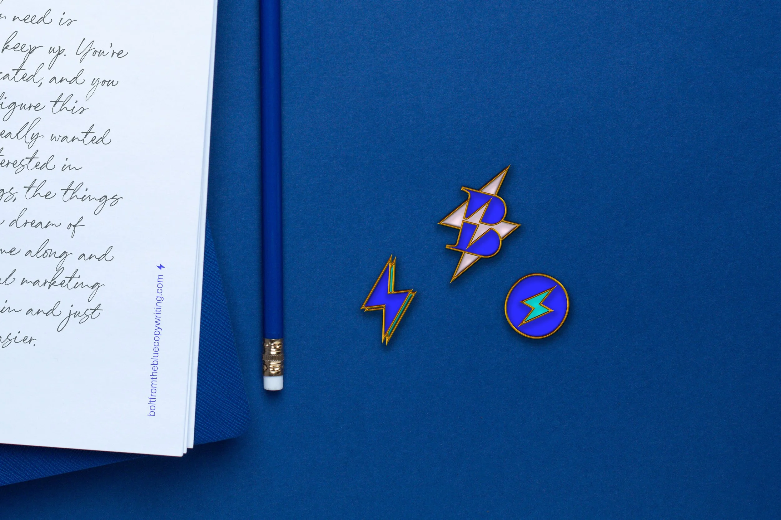
I developed a brand evolution strategy that created deliberate connections while clarifying each brand's unique personality. For Bolt, we freed the lightning bolt from its confined position within the letter "O", creating a more dynamic identity. For Rachel's personal brand, I distilled the pen icon to its essential nib form. The new colour system establishes a sophisticated bridge through a connecting accent (baby pink), while each brand maintains its signature colour — electric blue for Bolt and confident red for Rachel's personal brand — with Bolt receiving an additional turquoise accent. The typography was streamlined to three purposeful typefaces. This approach creates visual harmony while giving each typeface a distinct role.
-
The evolved brands now accurately reflect Rachel's market position as a premium consultancy while maintaining authentic connections to her creative roots. The system provides greater flexibility across different touchpoints while simplifying brand management. Initial feedback indicates the new brands better convey the sophistication of Rachel's work, resonating more effectively with senior executives in complex industries. By balancing strategic rigour with creative expression, the new brand system effectively communicates Rachel's unique value proposition: world-making words that amplify the voices of those doing meaningful work.
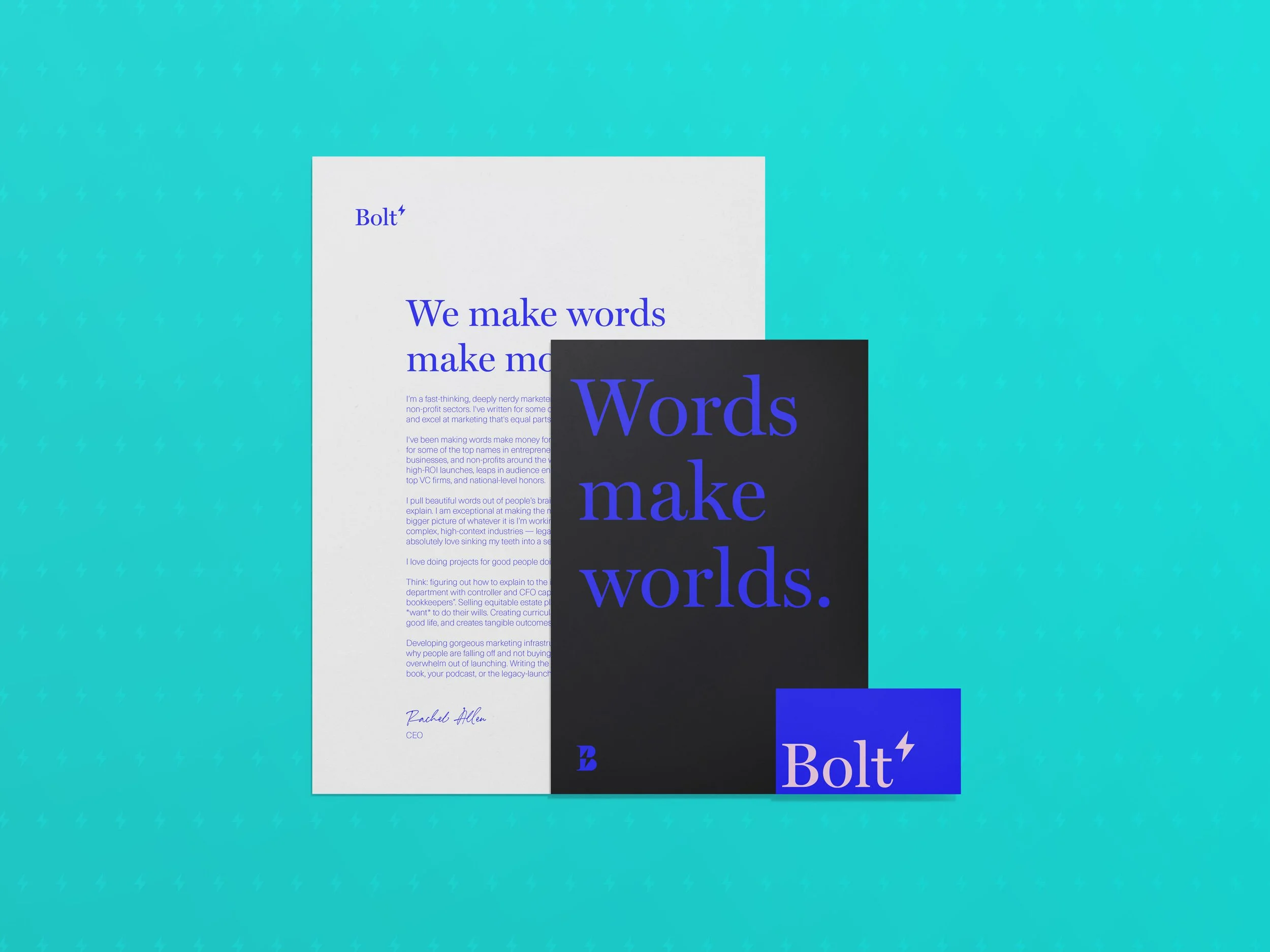
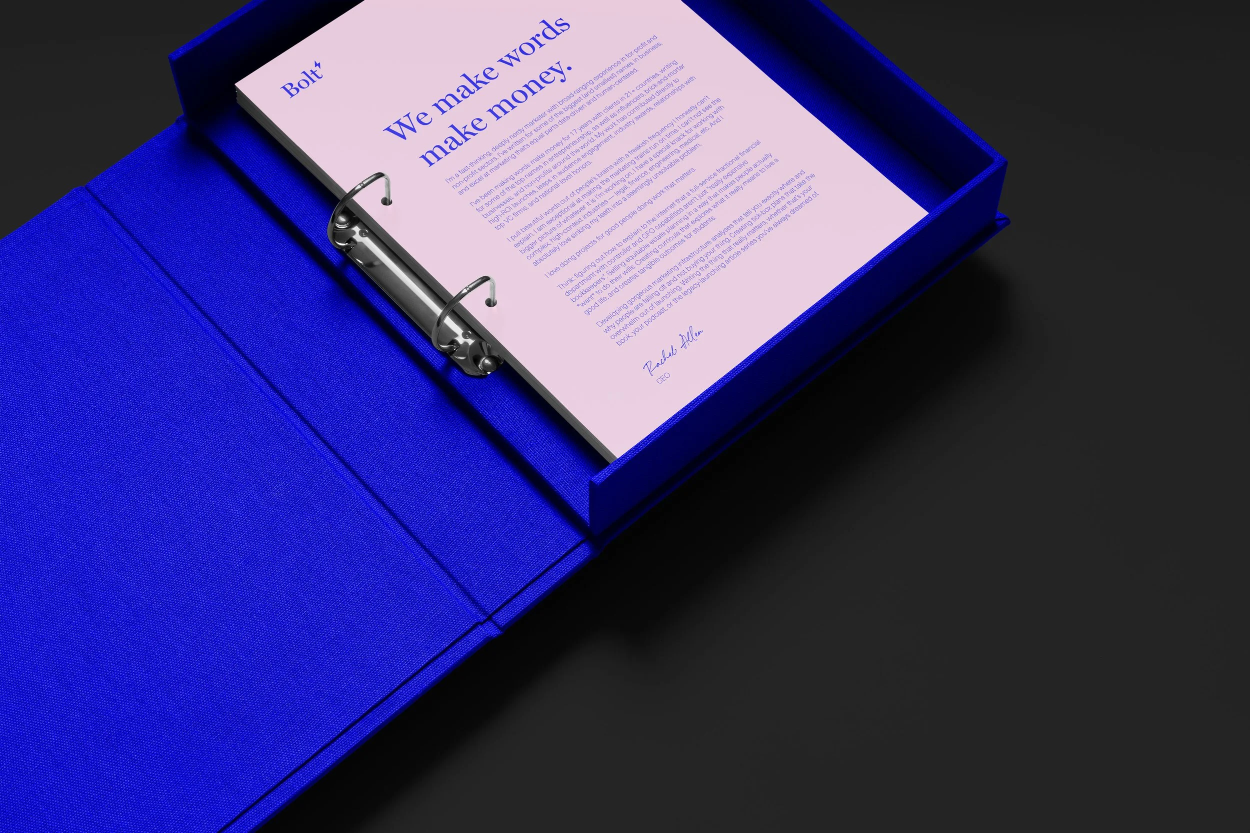
The Bolt logotype combines the grounded authority of Miller Display with the dynamic energy of the lightning bolt, now freed from its previous constraints. The typography's subtle quirks mirror the brand's personality, while the standalone bolt creates opportunities for more playful brand expressions.

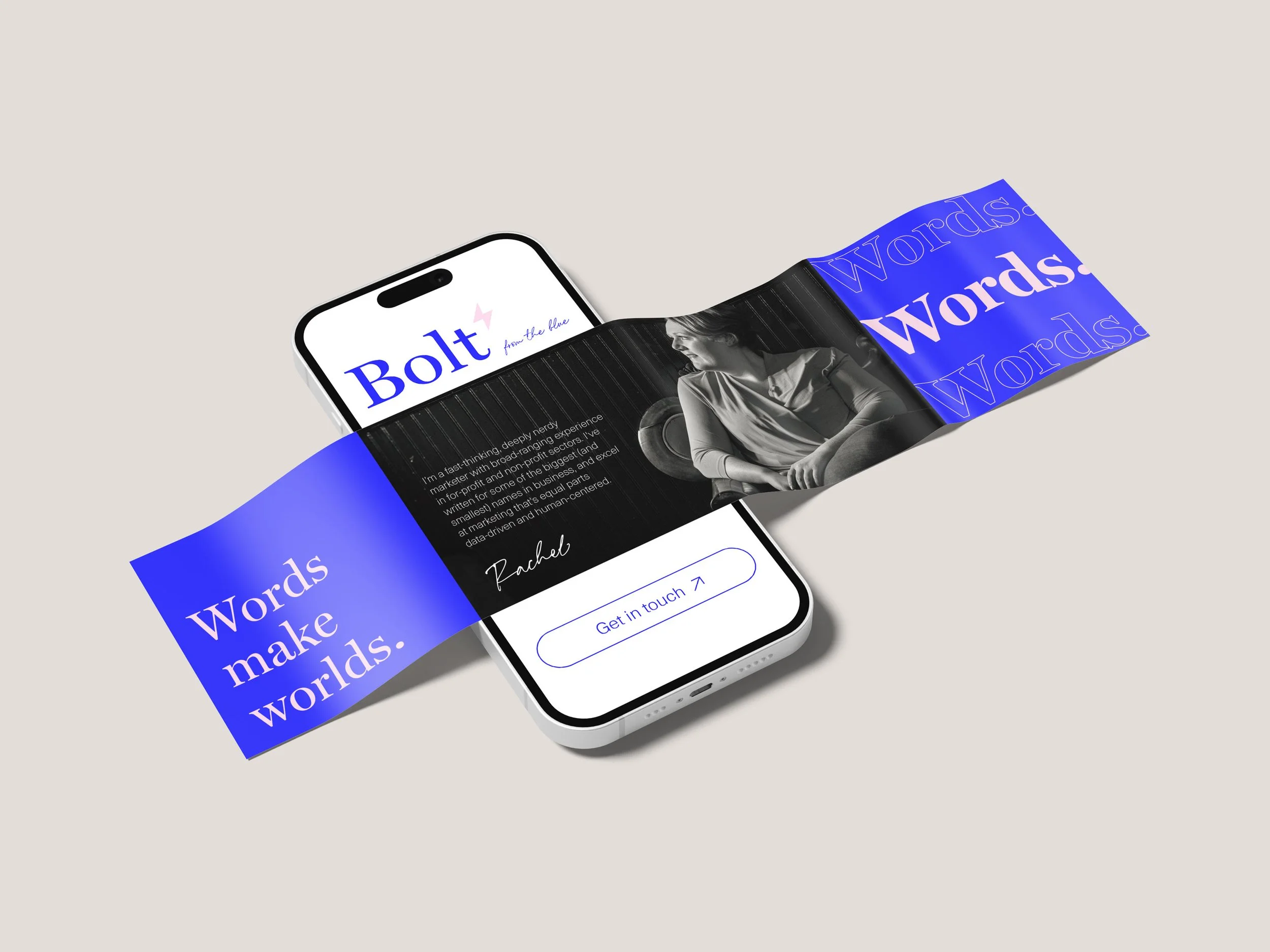
Solid colour blocks, combined with bold use of type, make for a confident visual presence.
We make words make money.
— Rachel Allen
The colour system demonstrates how both brands can maintain distinct identities while creating a cohesive family impression. The bold blue and red signature colours create immediate brand recognition, while shared neutrals and the baby pink and turquoise accents establish visual connections between the two brands.
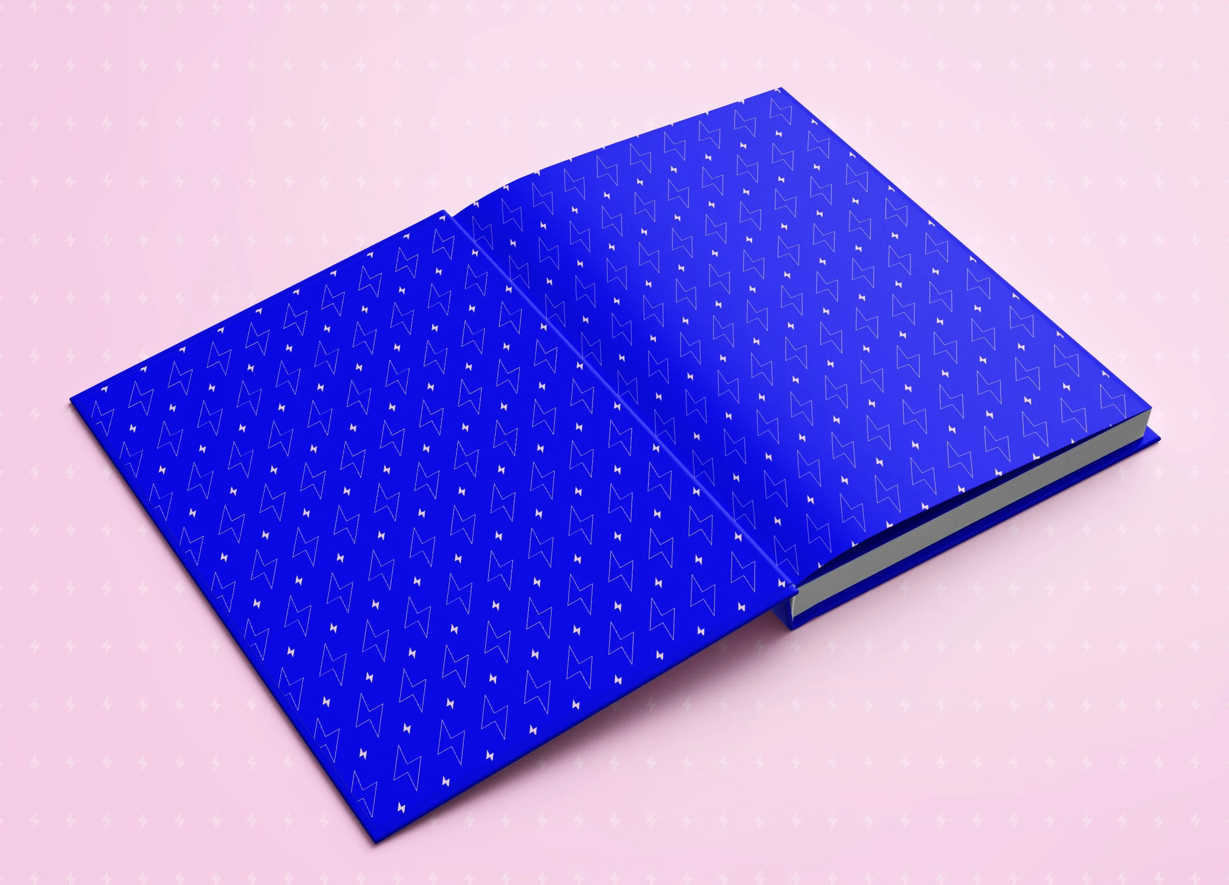
The lightning bolt is also used to create surface patterns — a delightful way to add interest and boost brand recognition across every little detail.
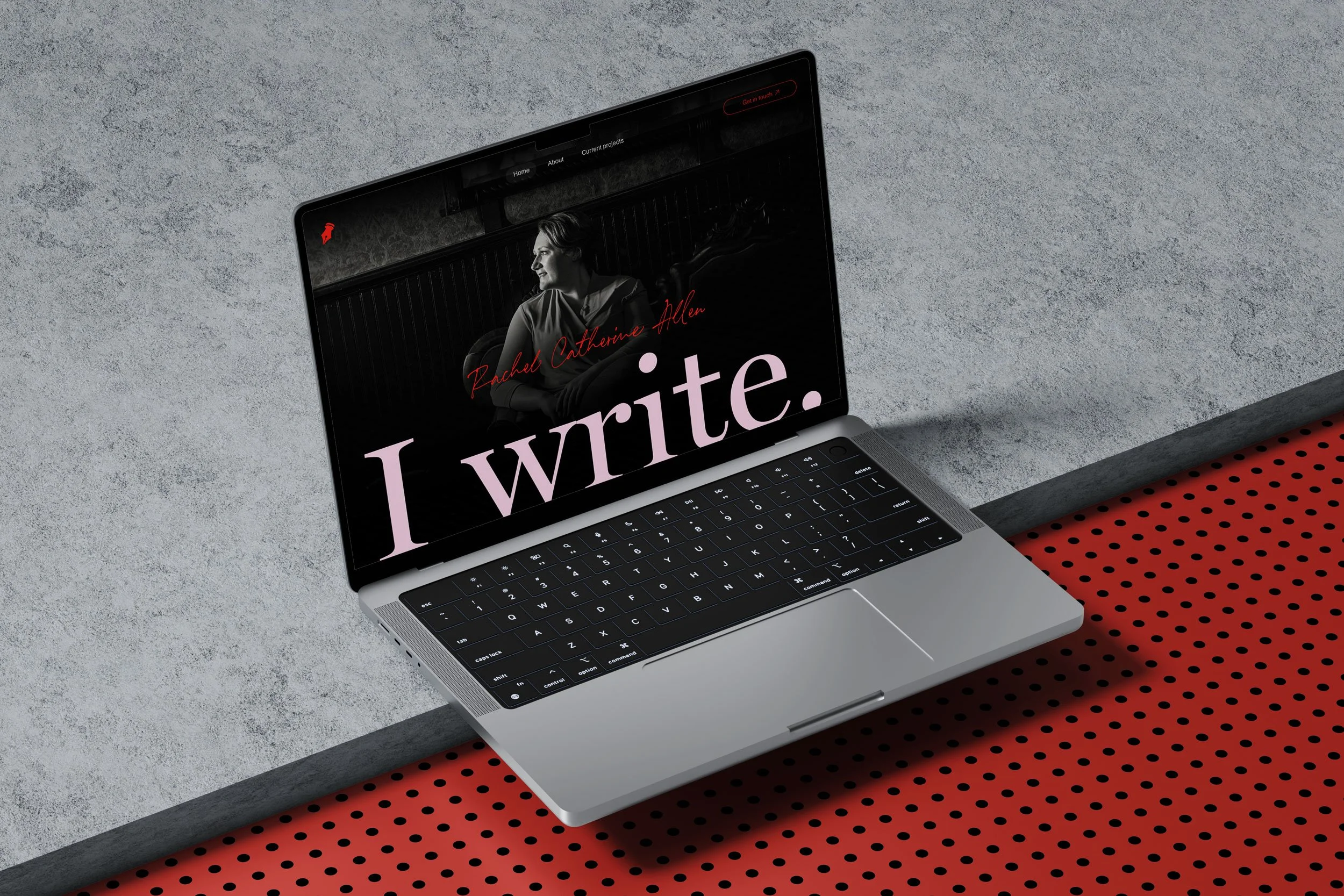
Rachel's personal logotype embraces the flowing forms of the typeface Anette Bradford, creating an immediate connection to the art of writing while maintaining sophisticated letterforms. The script conveys both personality and expertise, paired with the distilled nib icon that speaks directly to Rachel's focus on writing.