
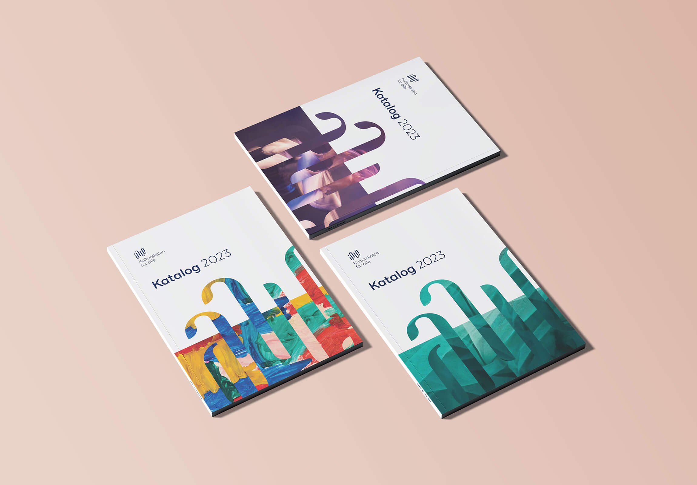
Music. Dance. Drama. Visual arts. Can one simple logo represent them all? That question took centre stage as I worked with Kulturskolen for alle to carve out their new brand identity.
How do we communicate their vision, their mission, their personality — all that this complex and diverse organisation is and stands for — in one unified visual identity?
The answer to the first question is, of course, no. The answer to the second question is: we craft a purposefully simple, yet infinitely flexible, brand identity to act as a container for it all.
-
Kulturskolen for alle teaches music, dance, drama and visual arts across three municipalities in Northern Norway, and their old visual identity didn't reflect any of that range. They came to me wanting a new logo, but the real brief went deeper: how do you represent four distinct art forms under one mark, appeal to funders in both the public and private sector, and still feel relevant to a six-year-old and a seventy-five-year-old alike? A single logo was never going to carry that weight on its own.
-
I built the entire identity around "alle" — Norwegian for everyone, and the clue to what this school is really about. The wordmark's soft, organic letterforms move like water, echoing the rhythm of the disciplines it represents, and it doubles as an ambigram, readable upside down. That ambigram then becomes a vessel — filled with student artwork and performance photography, so the identity isn't just something the school owns, but something students and teachers can see themselves in. Two shades of blue anchor a calm backdrop, with six accent colours giving the art room to be loud.
-
The school asked for a logo and left with a full visual identity — one flexible enough to stretch across four art forms and a genuinely broad audience, without ever losing its shape. It's distinctive without being rigid, and inclusive without being generic, which is precisely the balance an organisation called "for alle" needs to strike.


The entire brand identity revolves around the word “alle” (= Norwegian for everyone). This stylised wordmark is still legible, but the letterforms are soft, organic, and flow across an imaginary wave — adding movement and a sense of emotion, reminiscent of the ocean, the flow of music, a dance movement, the stroke of a paintbrush across canvas.
The wordmark is also an ambigram, a nice little detail to add interest.
We're both proud and grateful that our visual identity is receiving international recognition, and we see this award as confirmation of the value of purposeful, thorough design work. The investment has given us a clearer identity, strengthened recognition of the school, and a visual expression that reflects our quality and ambitions.
— Anne Sofie Mentzen, Principal
The ambigram becomes the star of the show when used as a decorative element. We literally fill it to the brim with all the creativity that this school of visual & performing arts contains; student artwork, as well as photos from performances and concerts. This enables not only the organisation, but also the students and teachers, to claim ownership of the brand identity.


The colour palette is based around two shades of blue — contrasted with six vibrant accent colours. This provides a calm base that does not distract too much from the vibrancy of the art, but also allows for pops of colour to add interest and contrast.


The typography is kept clean and simple to enhance, rather chan compete with, the bold use of decorative images.
Texta Alt is a spin on the classic sans serif, featuring subtle details that add a touch of personality, and an inviting, friendly look.