Built by an owner whose knowledge of plants and outdoor spaces runs as deep as her ambition for the business itself, Grøde needed a premium brand grown from their strong roots.
Over several years, Grøde had grown into a respected name, with customers travelling from well beyond the local area for their combination of design vision, horticultural expertise and genuine care. What they hadn't yet done was translate that quality into a brand that looked the part.
-
Grøde's existing identity had heart. A hand-drawn lily and a jugend-inspired typeface with a nod to nearby Ålesund's art nouveau architecture. It was personal, and it was clearly loved. But set against Grøde's target audience — established, resourced homeowners weighing up a significant investment in their outdoor space — it was working against the business rather than for it. The illustrative style read as closer to the hobby market than the premium one Grøde was aiming for. Add an owner with big vision and a small team, at real risk of spreading herself thin across too many priorities at once.
The brief wasn't simply "make it look more premium." We had to find a way to raise the identity into the market Grøde deserved to compete in, without asking the owner to let go of the thing she'd built with her own hands.
-
Before any design work, we ran a full brand platform process — vision, mission, values, personality, target audience and positioning — to give the business a solid foundation to design from, rather than working backwards from taste. That work resulted in a brand built on legacy, wholeness, enthusiasm and closeness, and a target customer who wants a considered, long-term partner rather than a quick fix.
The owner's attachment to the original identity wasn't incidental. It reflected exactly the kind of personal, generational thinking Grøde's strategy was built on. So rather than treat the existing logo as a problem to be solved, we treated it as a starting point to be refined. The brief became evolution, not erasure, and every design decision that followed was built on that same principle.
-
Grøde now has a brand platform and a visual identity that speak the same language, and that respects where the business came from while giving it room to compete for the premium clients it's already attracting from further afield.
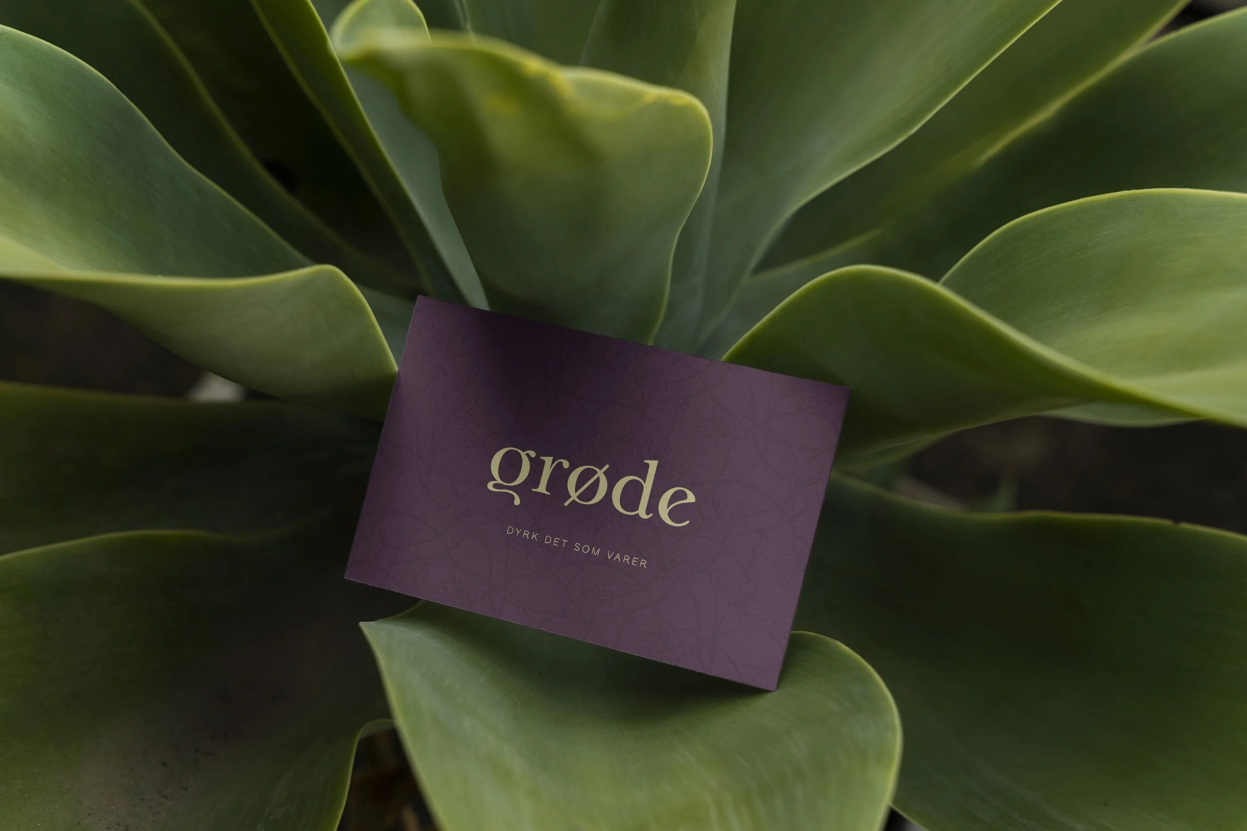
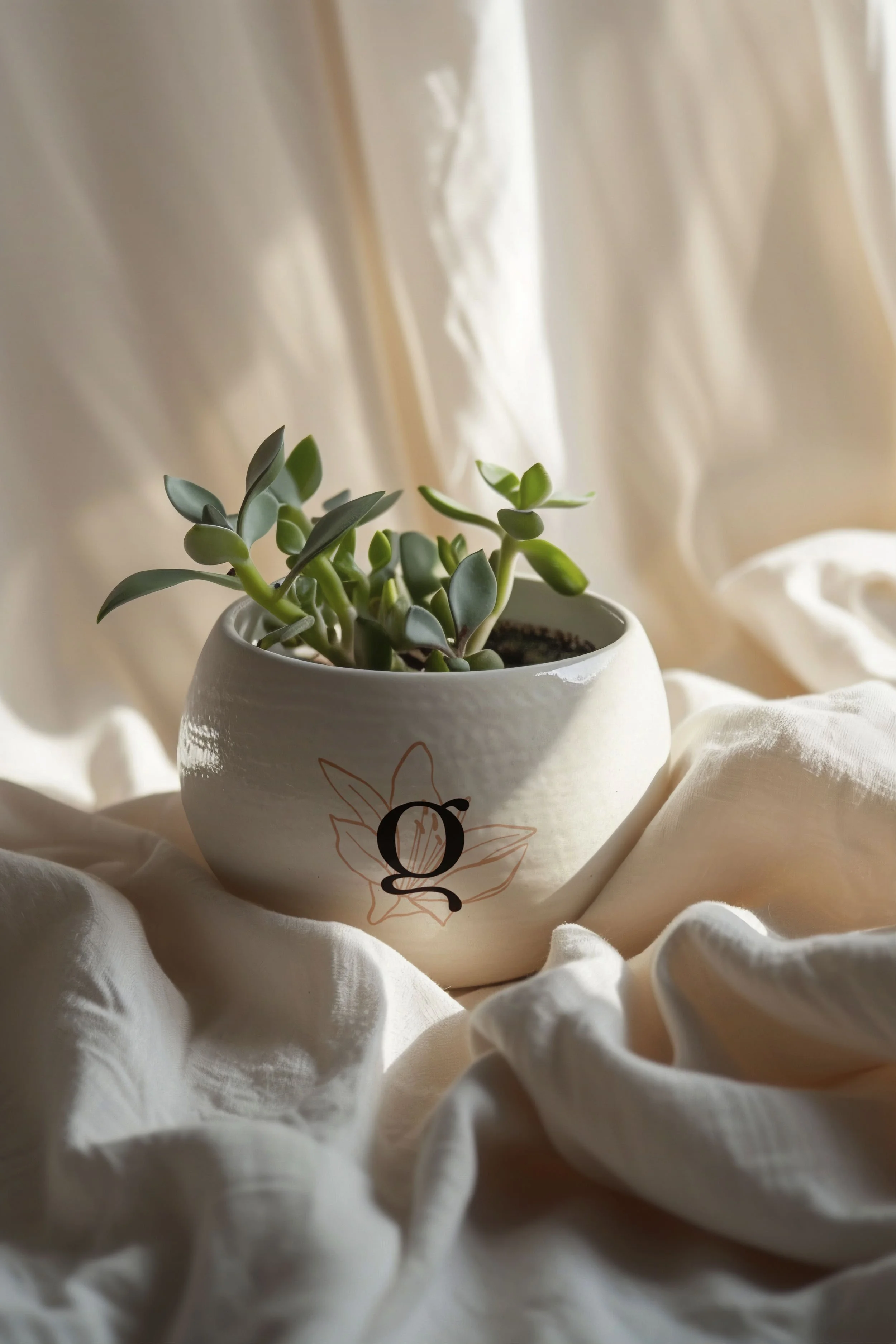
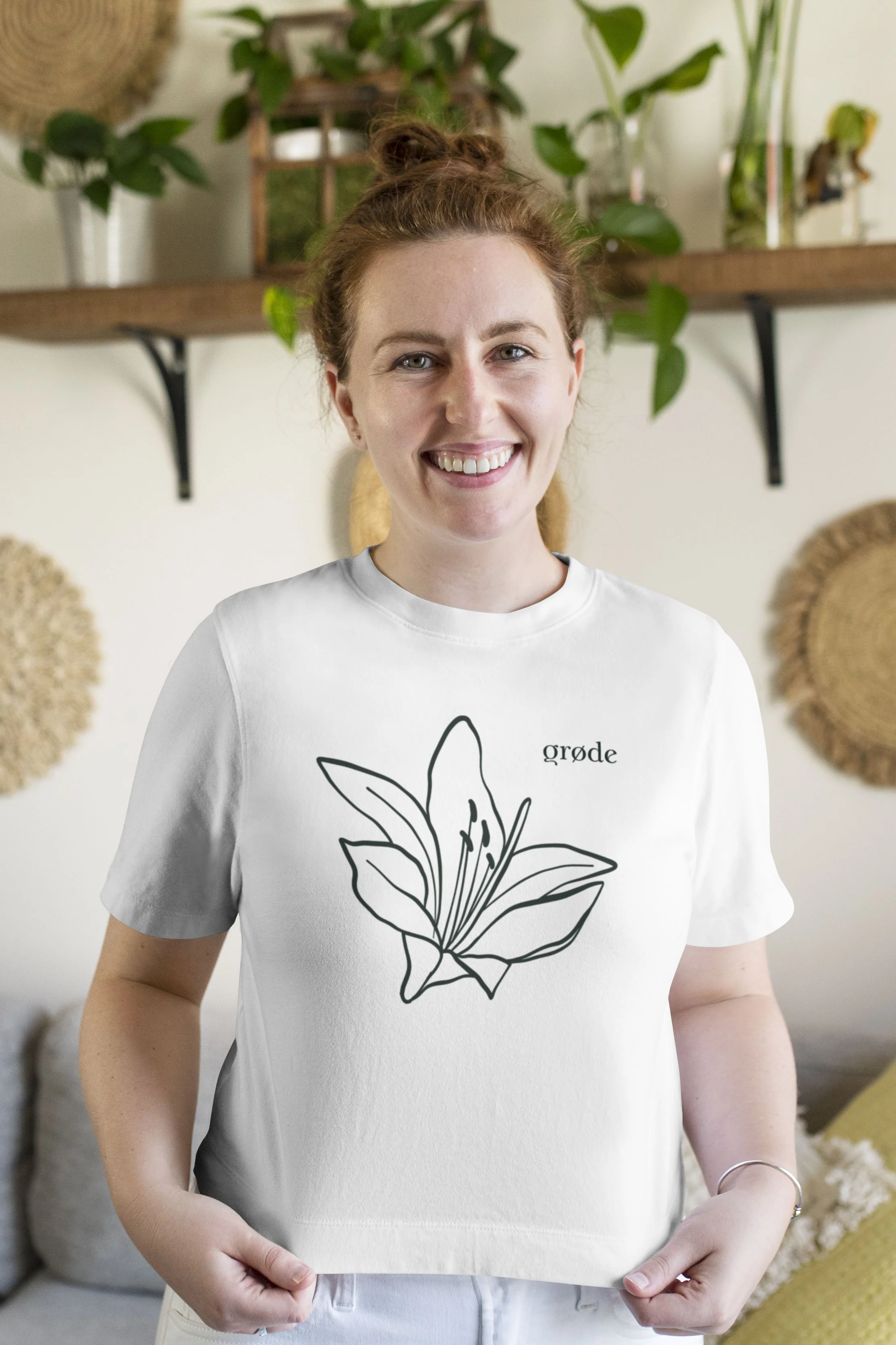
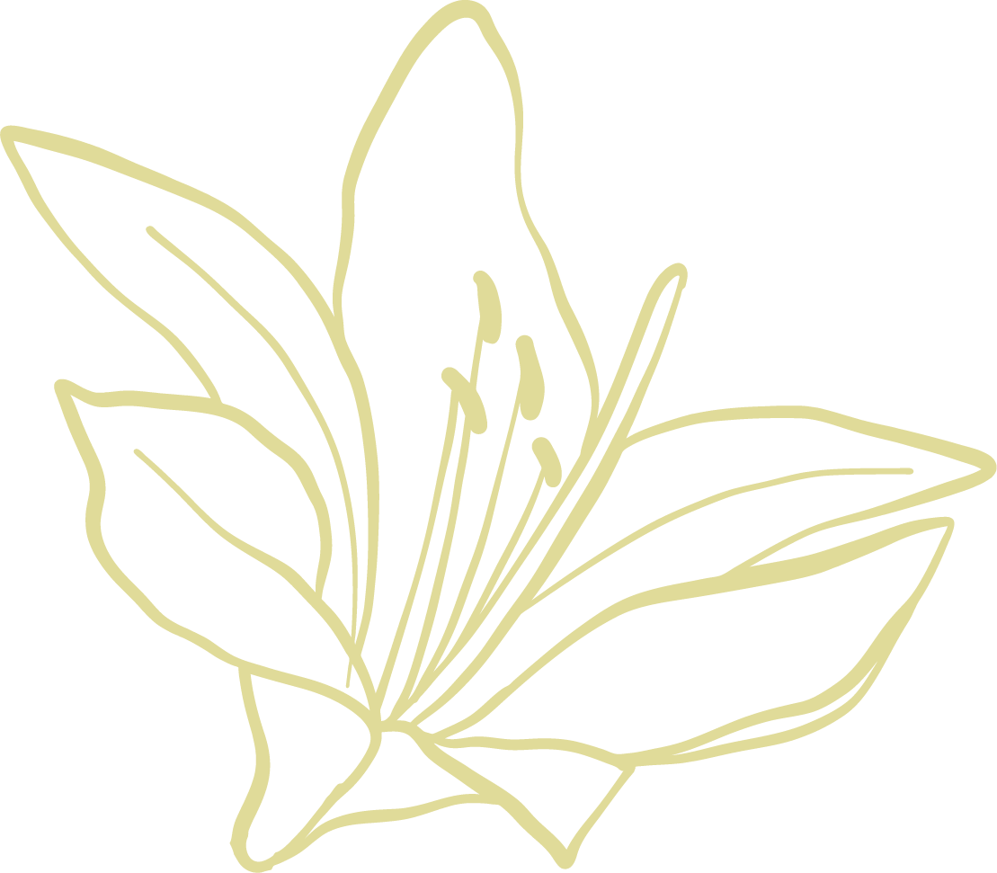
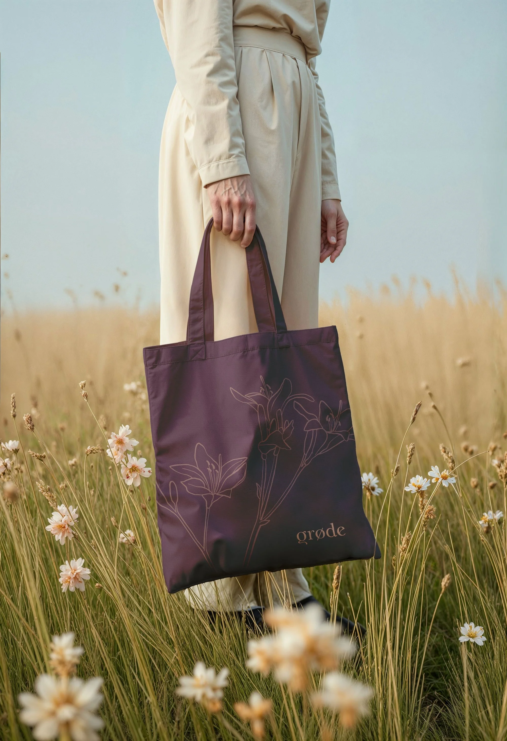
The lily from the original hand-drawn mark was set free from the logo altogether, and was also developed into a surface pattern.
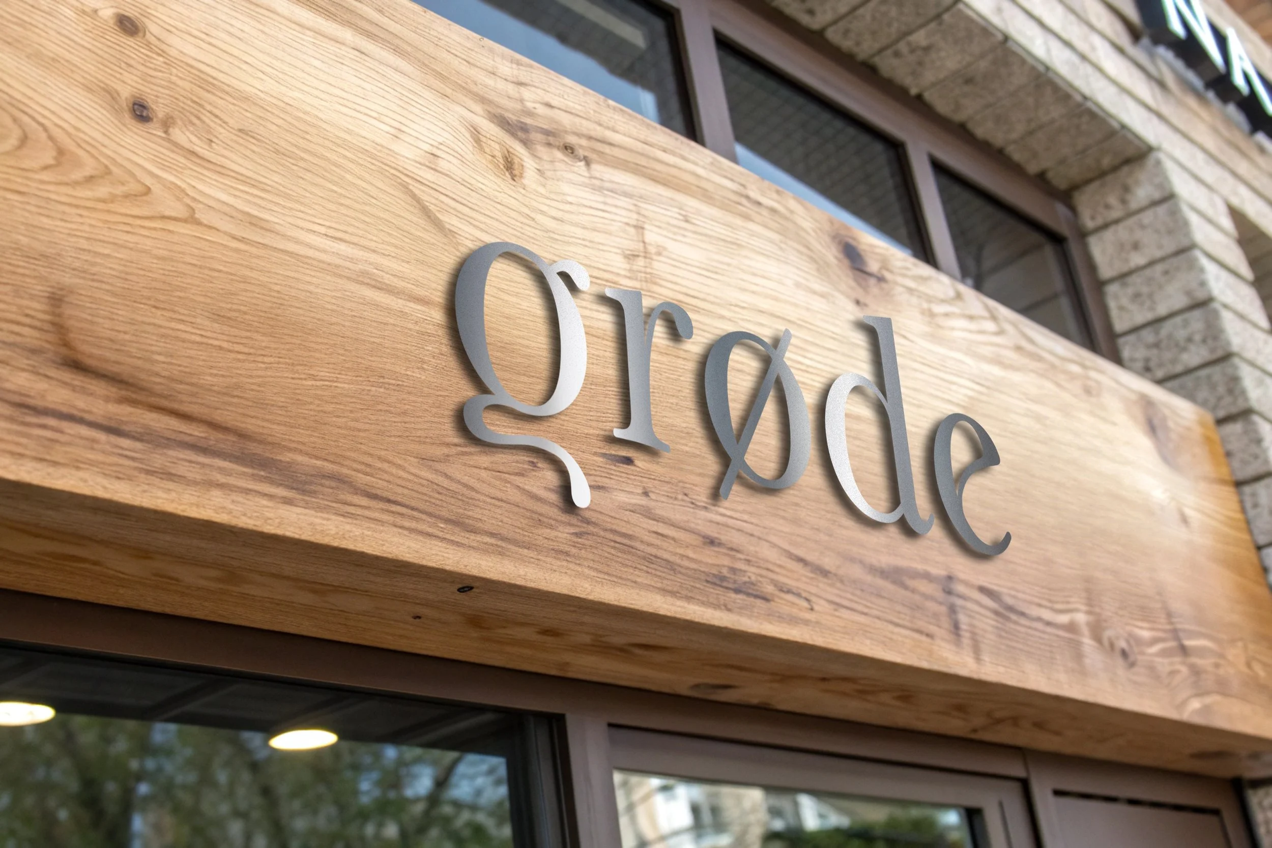
The wordmark was updated with a softer, more polished art nouveau-inspired typeface. It keeps the nod to Ålesund's architecture that made the original font choice so fitting, but with the refinement Grøde's premium positioning demands.

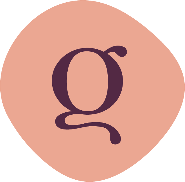
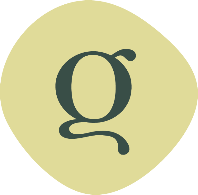
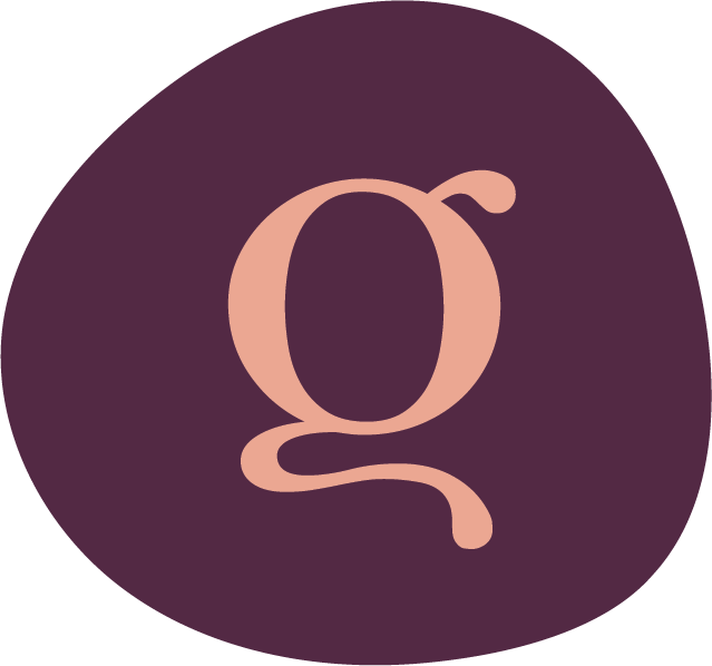

The colour palette is pulled from the garden itself: deep and light greens, aubergine, a soft blush pink. Grounded rather than sweet, it reflects the natural materials Grøde works with.
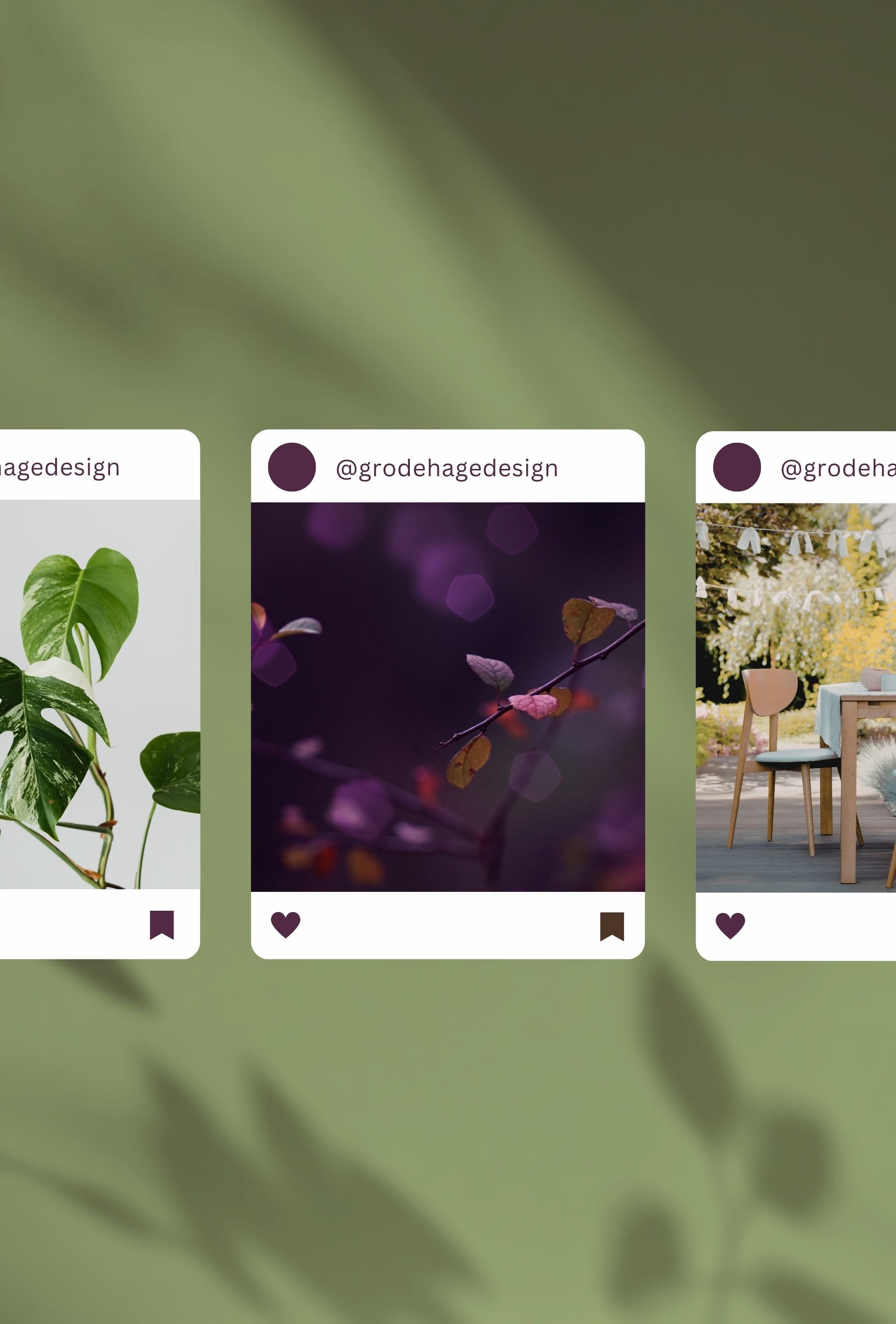
This soft freshness is also carried through to the photographic style.
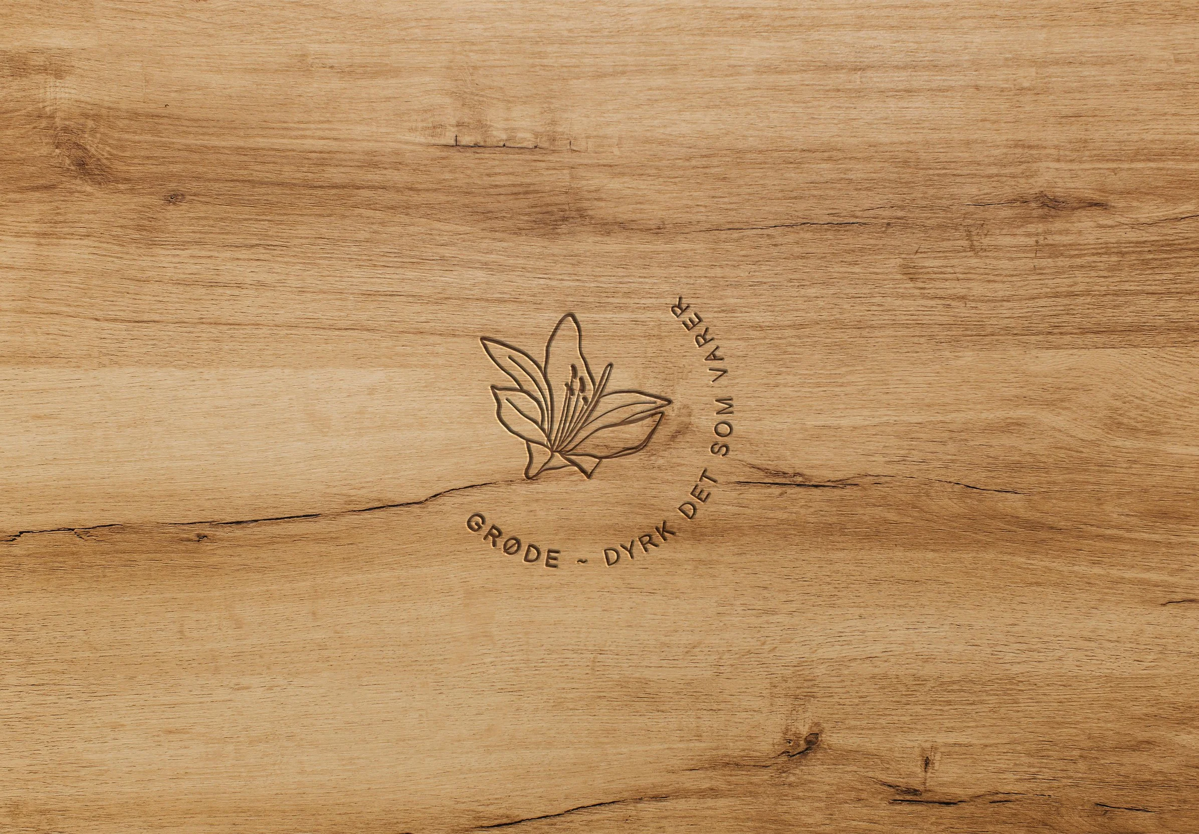
The full logo suite consists of the wordmark, a submark, and icons — that together with the lily offers the flexibility needed to create visual consistency across shopfront signage, packaging, digital and print.
Natural materials, such as terracotta and oak, add warmth and tactile personality.