How do you inject personality and stand out in a market saturated with corporate blue and generic "innovation" imagery — whilst still maintaining the credibility a professional audience demands?
When Jeanine came to me with Lilleng Driv, she needed to reach two fundamentally different audiences with the same expertise. Some clients are established companies with board mandates to digitalise but no clear roadmap, whilst others are startups and scaleups needing CTO-level guidance without the budget for full-time hires. I knew we needed to create a brand that would speak to both segments whilst establishing Jeanine's unique positioning as "den nysgjerrige veiviseren" — the curious guide.
-
Jeanine needed to differentiate Lilleng Driv in a crowded tech consulting market dominated by either cold, corporate agencies or generic freelance technical experts. Jeanine's approach emphasises continuity, partnership, and genuine curiosity over transactional project work, and she needed a brand identity that would move beyond typical tech consultant aesthetics whilst maintaining technical credibility.
-
Through a series of strategic workshops, we worked deep to develop a comprehensive brand platform that positioned Lilleng Driv as the impatient challenger — the curious guide who helps businesses navigate complex technology challenges with forward momentum. This strategic foundation was then translated into a visual identity system built around a distinctive typographic treatment where the final 'i' in the wordmark "leans forward" towards solutions, creating directional energy that captures Jeanine's impatient drive to solve problems and move clients forward.
-
The brand platform and visual identity work together to position Lilleng Driv as a sophisticated, human-centred tech partner distinct from both corporate consulting firms and typical freelance advisors. By combining credibility with warmth and approachability, the brand creates immediate resonance with clients who want genuine partnership over transactional relationships. The distinctive colour palette and dynamic visual system cuts through typical tech aesthetics, making Lilleng Driv instantly recognisable and memorable.
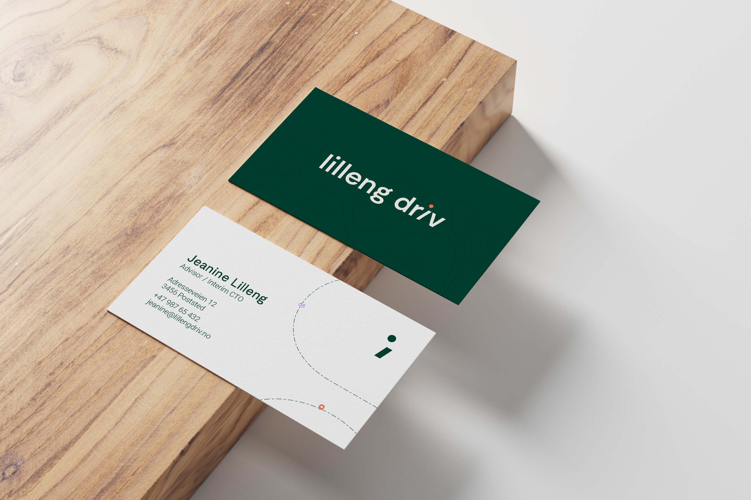
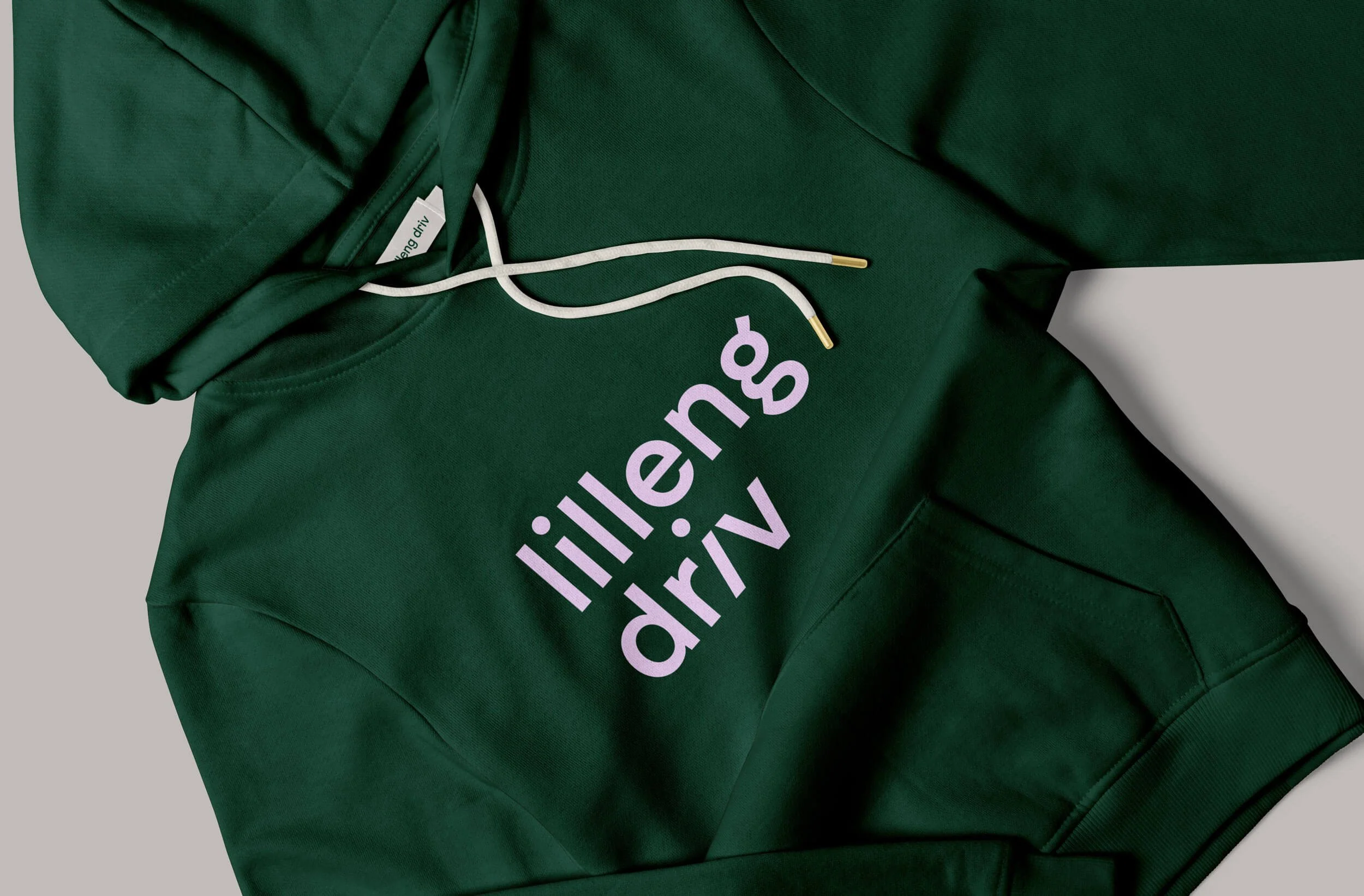
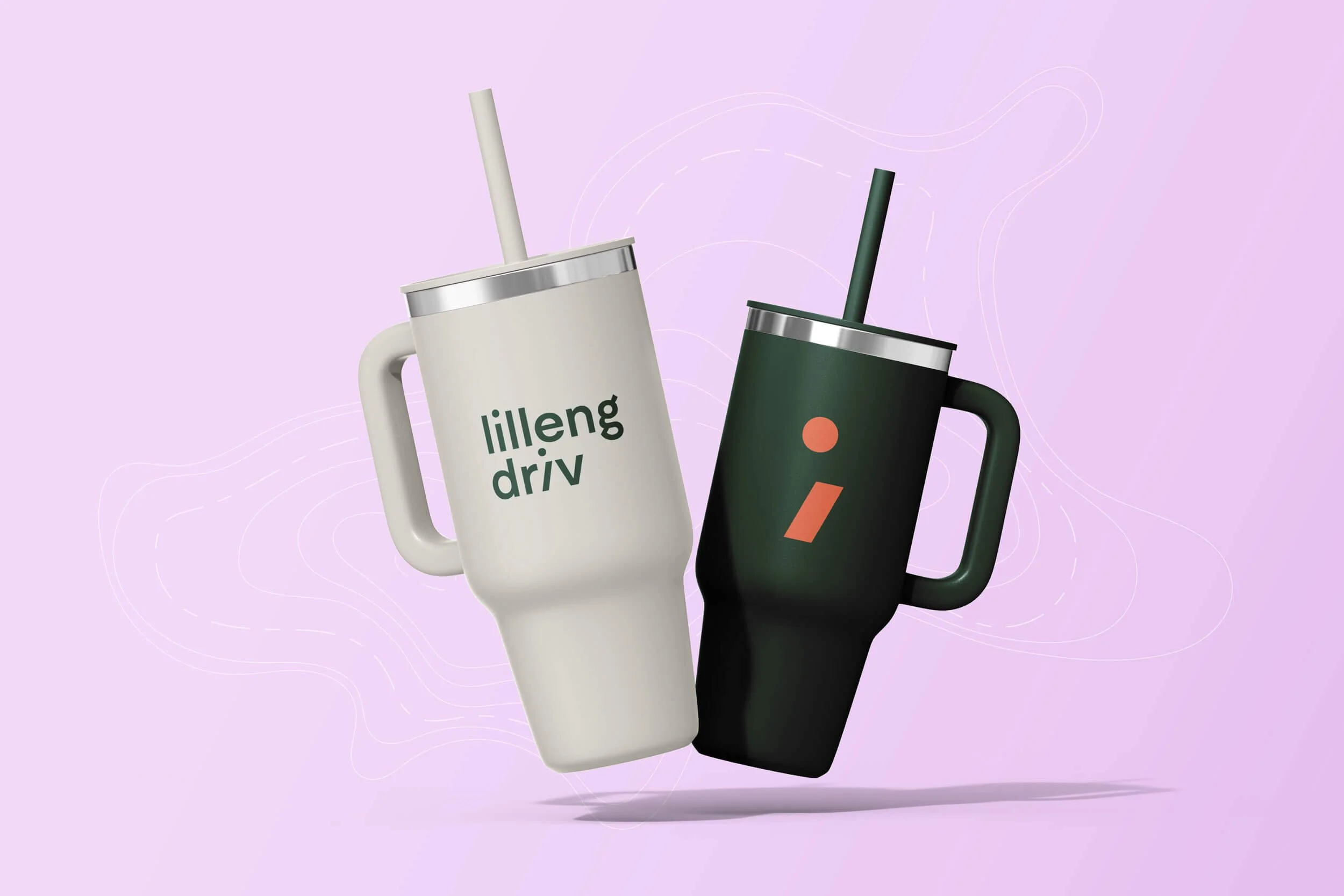
At the core of Lilleng Driv's visual identity is the typographic logo rooted in the positioning of the impatient challenger — visualised by the final 'i' in the brand name "leaning forward" towards solutions.
A segment of the skewed 'i' is used as a freestanding icon, forming a semicolon that symbolises how Lilleng Driv never simply solves a problem and then closes the engagement, but rather establishes systems that continue to function and evolve over time.
This semicolon becomes a powerful recurring motif throughout the identity, representing continuity and ongoing partnership — a concept that resonates particularly strongly with Jeanine's audience, who understand both its programming significance and its broader metaphorical meaning.
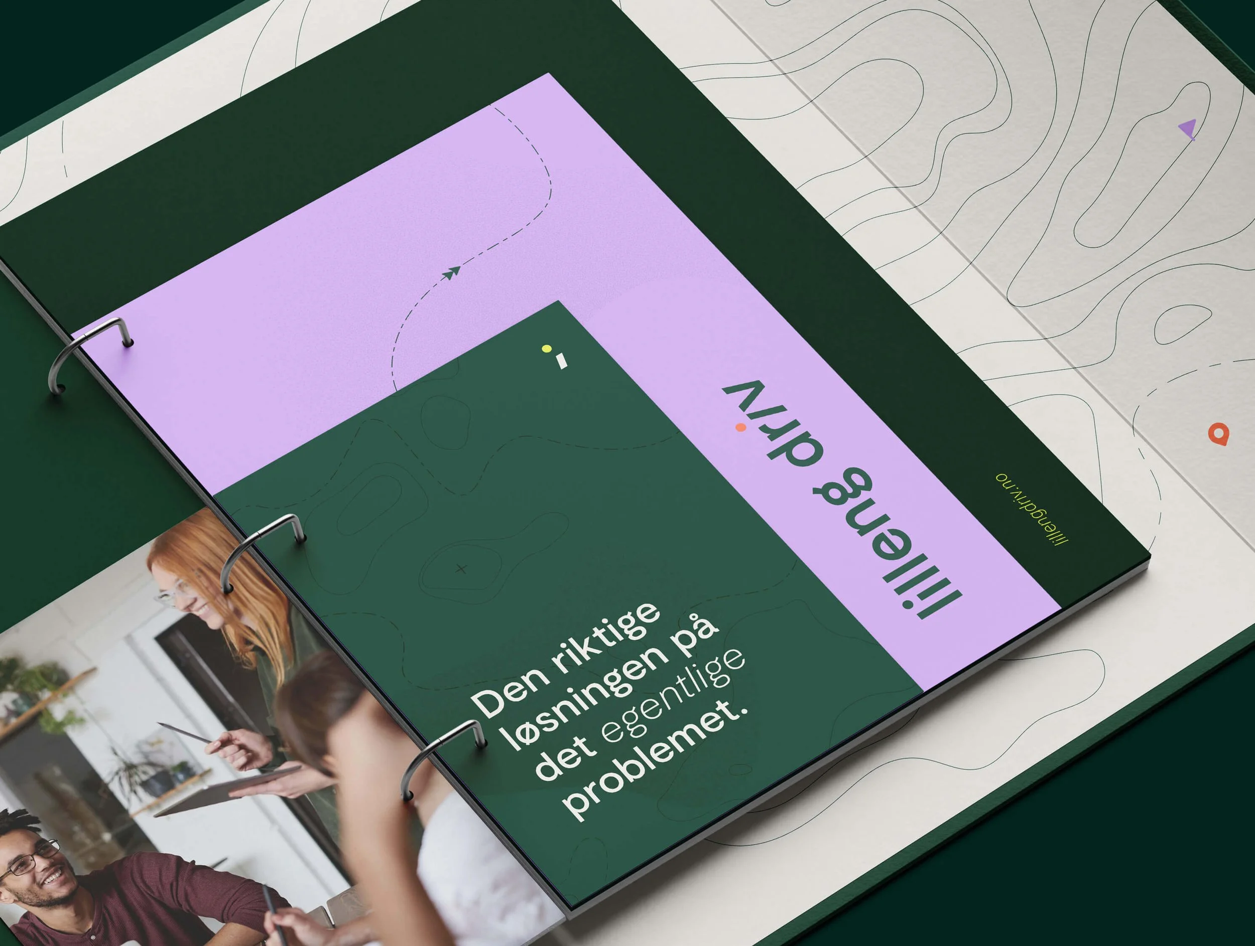
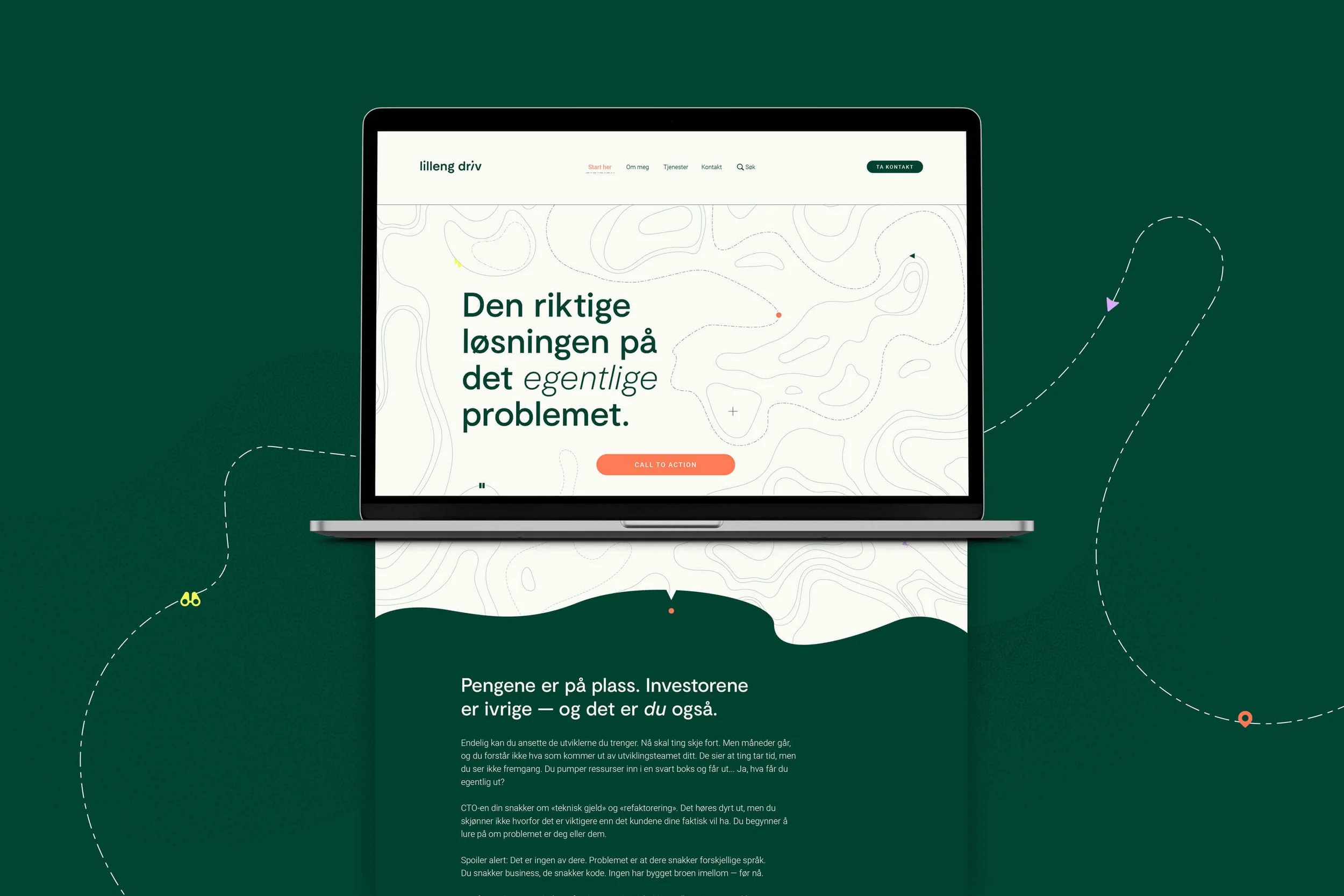
The colour palette is strategically differentiating, built on a foundation of dark green and warm white, combined with three sharp accent colours. The base colours provide a steady, calm foundation, whilst the accent colours create a visual signature that feels simultaneously energetic and trustworthy.
This combination clearly distinguishes itself from typical "consultant colours" and feels innovative and forward-thinking without appearing unstable or untested.
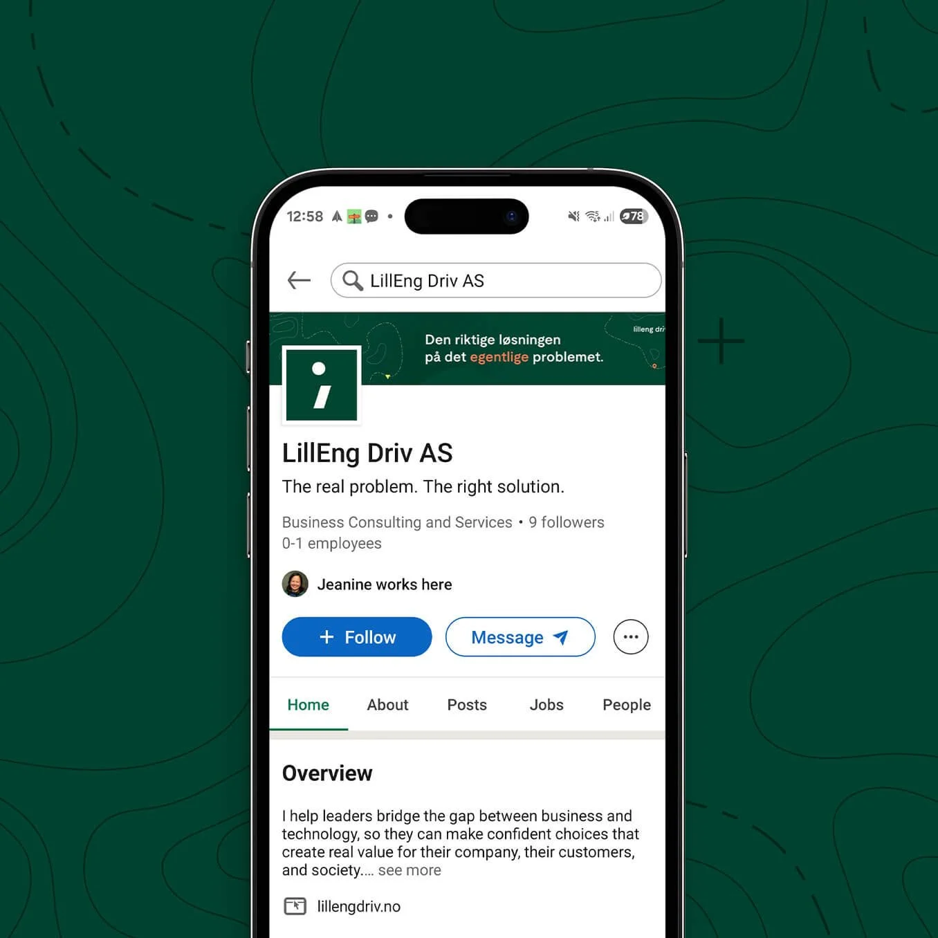
The right solution to the actual challenge.
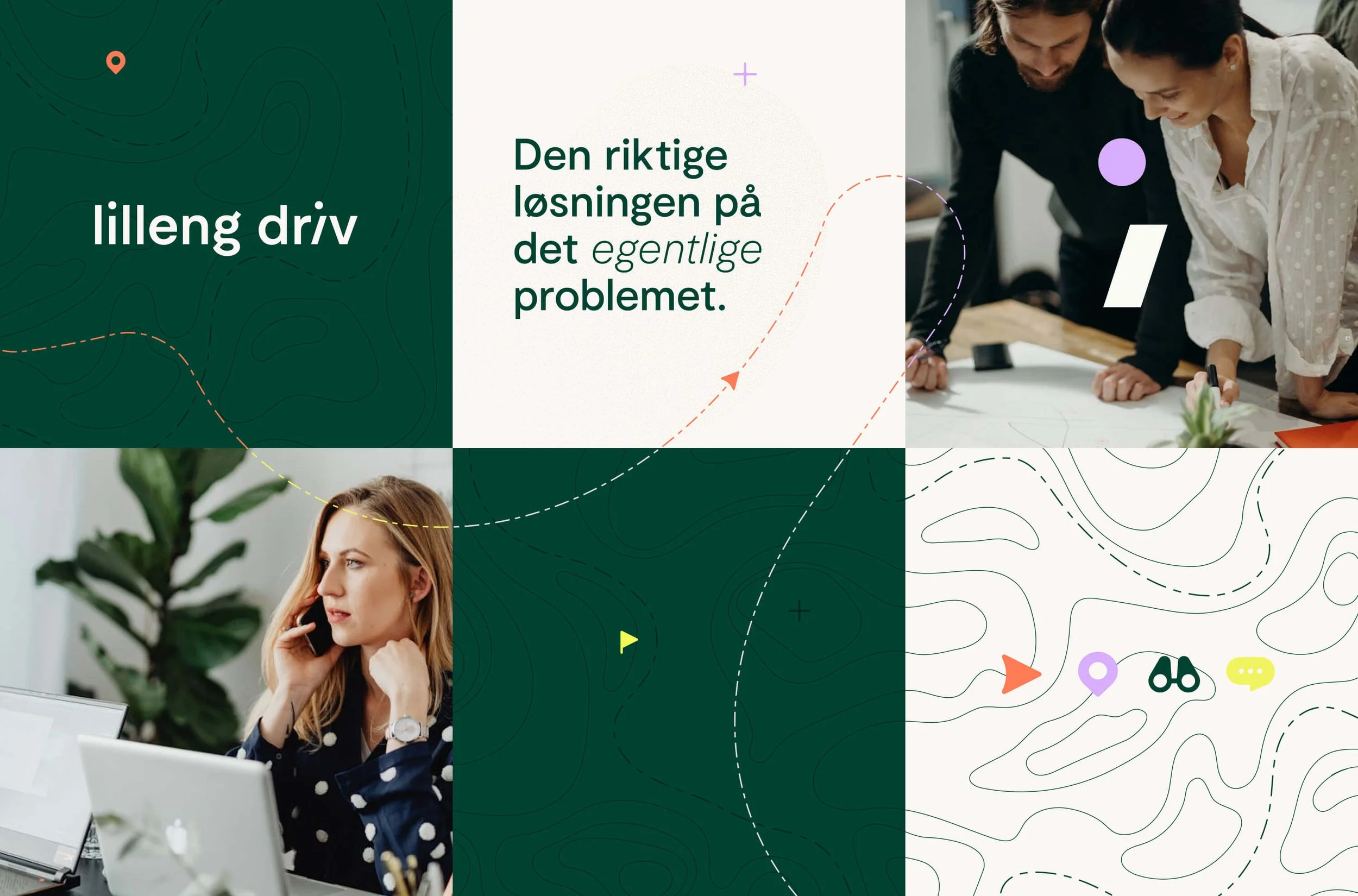
Decorative elements inspired by topography lines and wayfinding iconography reinforce the "curious guide" metaphor throughout the identity. These navigation-inspired graphics create visual interest whilst strengthening the positioning — mapping out the terrain of complex technology challenges and suggesting pathways forward.
This adds depth and sophistication to the system, distinguishing it from flat, minimalist tech aesthetics whilst maintaining clarity and purpose.