When CGuard approached me about developing their brand identity, I was immediately drawn to the strategic challenge: launching a distinct sub-brand to reach a fundamentally different audience with an existing product.
Whilst the parent company served maritime, offshore, and fish farm operations, CGuard needed to speak to defence, police, and search-and-rescue professionals operating in high-stakes, mission-critical environments. I knew we needed to create a brand that would establish immediate credibility with elite operators who can't afford equipment failure.
-
CGuard faced the challenge of repositioning what was essentially the same product for a more demanding audience, in a mature market dominated by established international players. Whilst their engineering is exceptional and offers genuine strategic advantages, they needed a brand identity that would differentiate them from both their parent brand and established competitors.
-
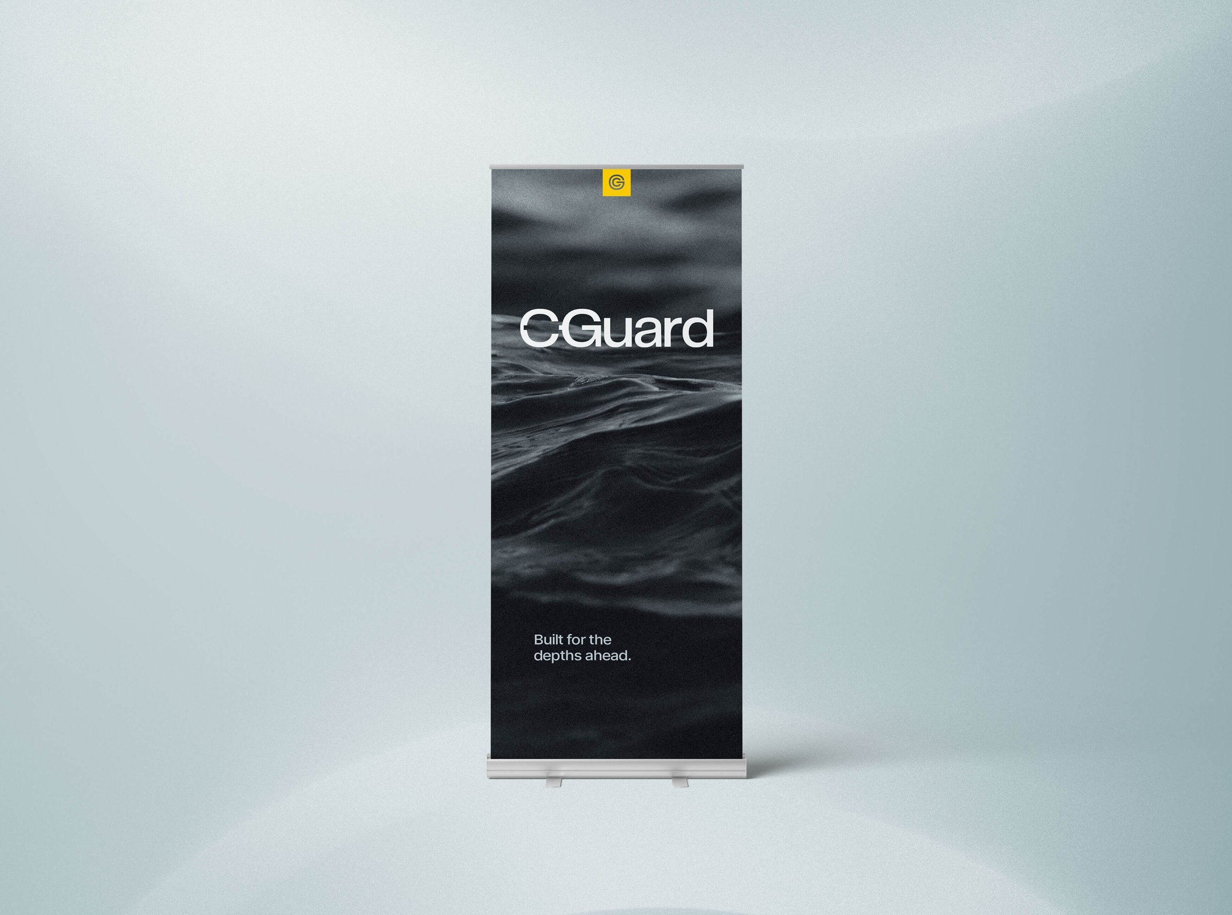
We positioned CGuard as The operational advantage / The rugged workhorse / The tactical partner, and captured this in the tagline "Built for the depths ahead"— a short sentence that acknowledges both the literal operational environment and the metaphorical reality of unknown challenges. This was then translated into a visual identity system that is direct, confident, and understated.
-
The new brand system positions CGuard as a premium, strategically differentiated player distinct from both its parent brand and established competitors. By speaking the language of operators rather than marketing committees, the brand creates immediate credibility with the target audience. The dark, industrial visual identity cuts through typical maritime tech aesthetics, making CGuard instantly recognisable at trade shows and in competitive contexts.
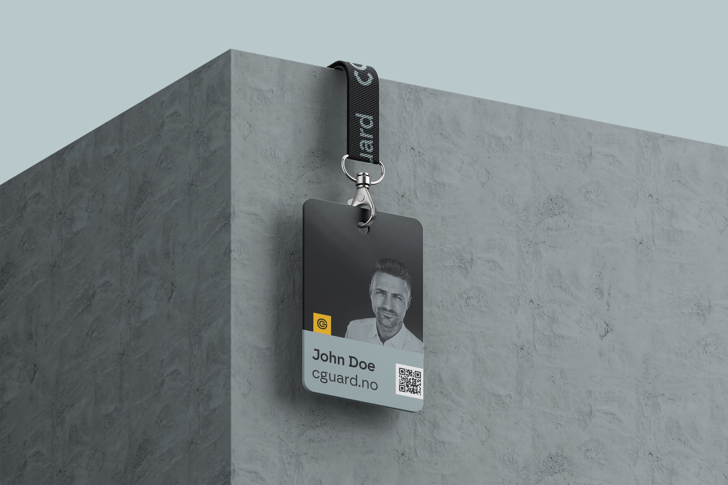
The wordmark subtly connects the C and G, suggesting both the guardian concept and the modular, interconnected nature of the systems. The connection is restrained enough to maintain legibility whilst adding intentional meaning for those who look closely.
The initials are combined to create a free-standing brand mark, where the G forms a protective shield around the C. Together they also resemble a power on/off button.
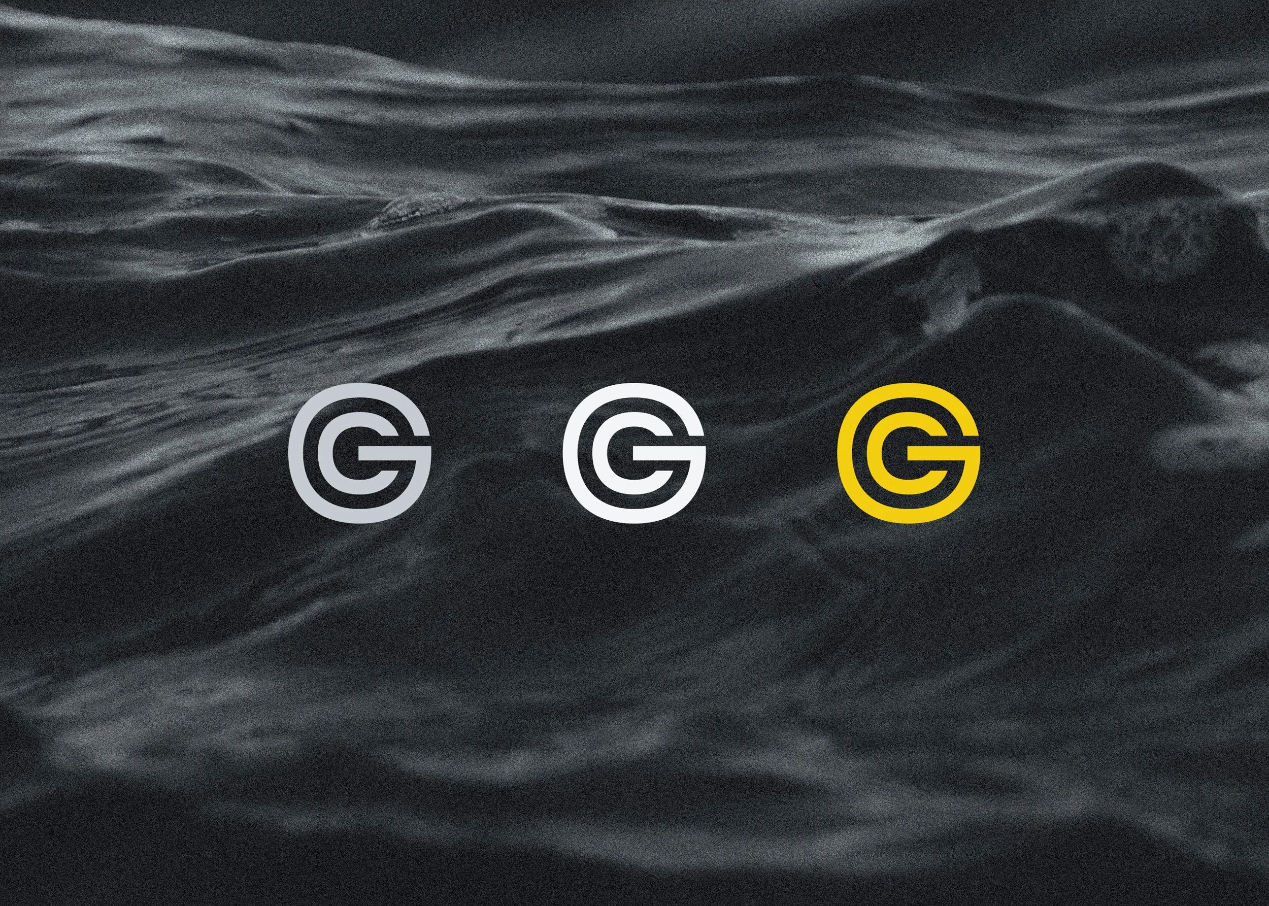
The colour palette of Stealth (soft black), Shadow (steel grey), and Beacon (warm yellow) reflect the dual nature of CGuard's ROV systems, which operate in both stealth configurations for covert operations and high-visibility variants for search-and-rescue missions.
The yellow offers a visual link to the product and to the mother brand, and is used sparingly — as a way of adding visual interest and highlighting important information.
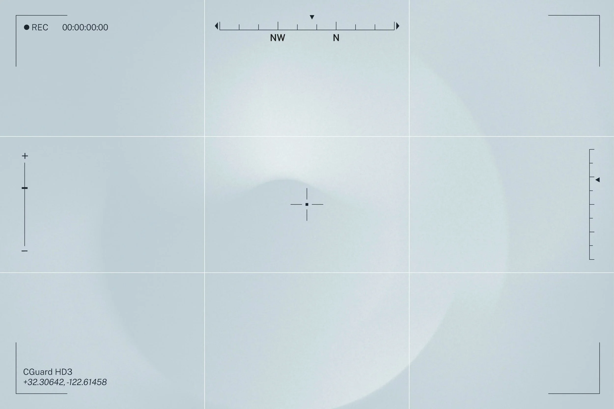
Decorative elements inspired by the viewfinder of an ROV are coupled with abstract, grainy background textures that are reminiscent of underwater light refractions.

Working with Petchy has been genuinely valuable for us at CGuard. Solveig combines a strong strategic understanding with the ability to translate complex needs into a clear, relevant brand. The result isn't just visually strong — it's also firmly grounded in who we are and where we're headed. This award is a well-deserved recognition of both her expertise and her approach.
— Lars Gaupset, CEO
Photography follows a deliberately grainy, dark aesthetic that feels authentic to operational environments rather than polished marketing. Images suggest underwater operations, technical precision, and the demanding conditions where CGuard systems perform. Lighting is dramatic and purposeful, often featuring high-contrast scenarios that mirror the Stealth/Beacon duality.